Branding & marketing
Biscayne Realty Identity
A brokerage identity that combines coastal color, readable typography, and flexible property marketing materials.
Wordmark direction · Fictional brand
Biscayne Realty Advisors
Local knowledge. An expansive outlook.
Primary
#175E62
Supporting
#DCE5D9
Accent
#A84936
Paper
#F6F5F1
A consistent first impression.
Stationery concepts bring the identity into everyday business touchpoints without adding visual noise.
Business card front · Concept
Biscayne Realty Advisors
Business card reverse · Concept
Local knowledge. An expansive outlook.
Miami, Florida
Typography with a clear voice.
Bold headlines and readable supporting text create a clear, flexible hierarchy.
DM Sans · Bold display headlines
A clear
point of view.
DM Sans · Everyday information
The details deserve attention.
A considered brand helps the important information stand out, from the first property introduction to the next client conversation.
A property campaign that feels connected.
A reusable composition keeps regional context, a clear message, and the brokerage identity working together.

Listing campaign concept
Space with
perspective.
Biscayne Realty Advisors
Miami, Florida
Regional photography: Miami waterfront skyline by Gaetano Cessati, CC0 1.0. Source thumbnail used with responsive display crops. No photographic retouching. The photograph depicts the city context, not the fictional sample asset. Full photography credits.
More sample concepts
Explore another approach.
See other concepts for this service, with distinct visual styles and useful experiences.

real estate
Wordmark. Color. Applications.
Fictional design concept
Pacific Partners Identity
Explore the sample
real estate
Wordmark. Color. Applications.
Fictional design concept
Mercer Commercial Identity
Explore the sample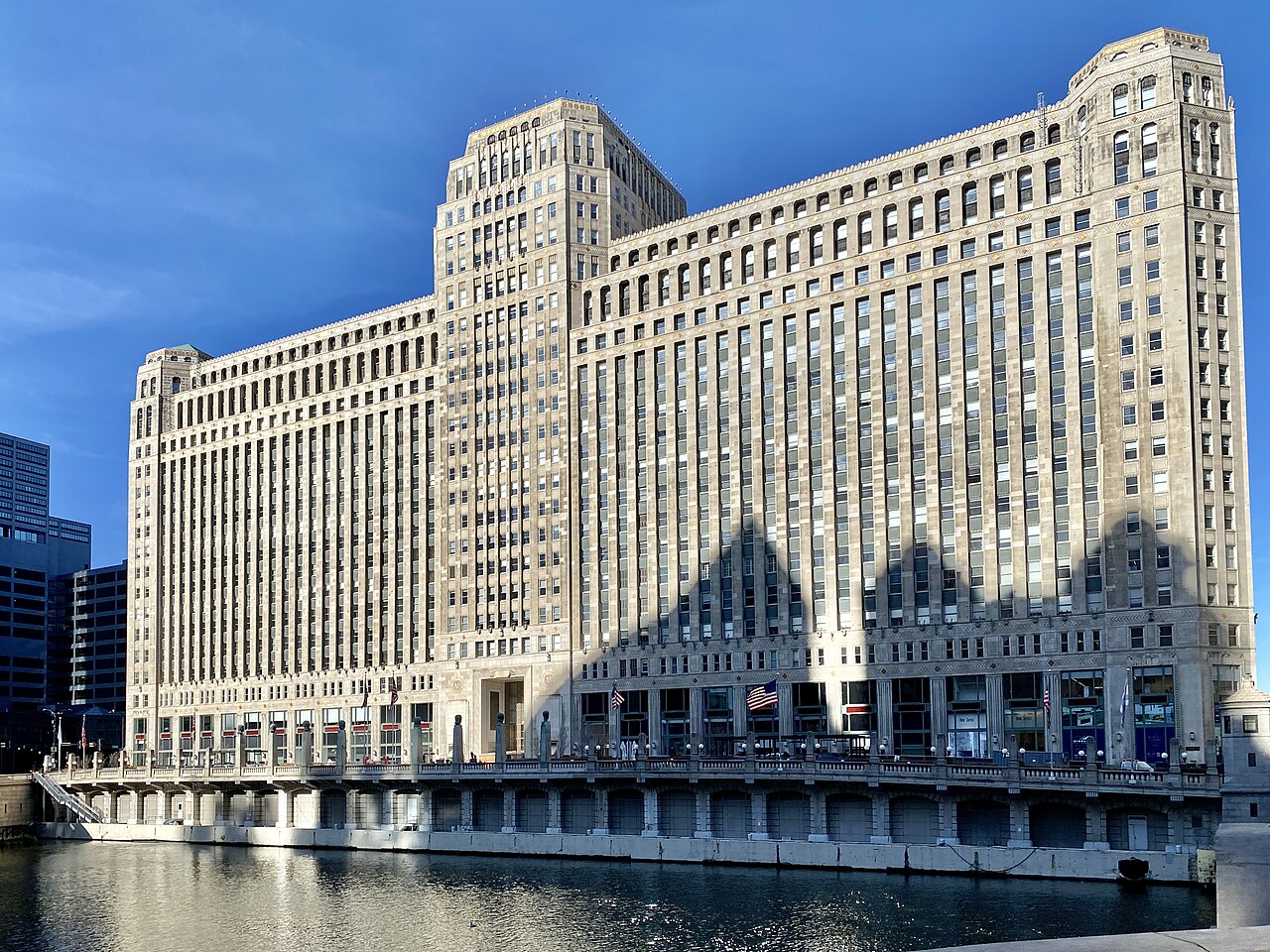
real estate
Wordmark. Color. Applications.
Fictional design concept
Fulton Commercial Identity
Explore the sampleGood work starts with a conversation
Let’s shape it around your business.
These concepts are a starting point. Your project begins with your real firm, your market, your information, and the goals you want to achieve.